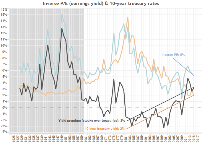
I get a lot of comments that make me feel insane because I think stocks are fairly valued, or that you could be waiting forever for the next big crash. Just so you know, I’m a big fan of Benjamin Graham’s The Intelligent Investor, I love companies with low 10-year PE ratios, and I do fret about current valuations.
However, because interest rates are low, and set to stay low for a long time, I’m becoming more confident of the idea that stocks are in fact fairly valued. Actually, I think they could be a little on the cheap side as the difference between corporate earnings / price and 10-year treasuries is higher than it has been since 1980. That’s not to say there aren’t better valuations in non-US markets, but it’s hard to argue for sticking with cash or bonds.
In any case, let’s go to the graph that shows our current “bubble”. I got this from a Forbes article that argues disaster is inevitable. Looking at the below, it’s hard to argue that valuations are reasonable. If we’re going to revert to a historical mean, then watch out!

But what is this graph really showing? Well, first of all I take issue with the other’s statement that “The incessant push to inflate our economy and financial markets has created an unprecedented situation in which stocks have been trading at overvalued levels for a record length of time.”
What would the author prefer? Perhaps we should go back to deflationary 1930’s policy so that investors constantly worry the economy is on the verge of collapse. That would certainly make stocks a lot cheaper. Or we could have ultra-loose monetary policy leading to higher interest rates, making equities a lot cheaper because of the high returns on bonds.
It’s one thing to look at historical CAPE, quite another to understand the historical context in which past low (and high) valuations occurred. Let’s go through each era:
- 1890’s – early 1910’s (high-ish, slowly rising): Here we’re looking at the end of the free silver movement, the discovery of vast new sources of gold and a nice, stable inflation leading up to World War I. The period did see a major panic, which brought valuations lower towards the end.
- late 1910’s – early 1920’s (low): With WWI inflation and an early 1920’s severe deflation, it’s not hard to see why valuations would be so low during this period of instability.
- late 1920’s (rampaging, bubble-like): A newly active Federal Reserve, able to guarantee economic stability for longer periods of time, pushed valuations higher. Perhaps markets got a little carried away towards the end, but a lack of volatility certainly should be rewarded.
- 1930’s – 1940’s (low): With the Great Depression and World War II, it’s again no wonder why equities would be so poorly valued during most of this period.
- 1950’s – 1960’s (high-ish, slowly rising): A stable new Bretton-Woods system combined with relative geopolitical stability would produce higher equities prices.
- 1970’s (low): Stagflation, monetary breakdown, oil embargoes and statist fiscal policy characterize this era. Loose monetary policy produced high inflation, which then led to high interest rates. This all made equities a much tougher sell.
- 1980 until now (high, rising): Paul Volker broke the back of inflation at the beginning of this period. The Greenspan/Bernanke/Yellen era has been characterized by very stable prices and stable nominal GDP growth. The panic of 2008 called that into question, but the Fed staved this off, essentially promising no long-term deflation like we saw in Japan.
While CAPE is historically high, within the historical context it’s easier to see why. We’re living with a fiat currency where the central bank has full control over nominal aggregates (if it chooses to exercise that control). With successive rounds of QE, the Fed has told us we won’t put up with falling prices or rising real debt burdens. Not only that, we have decent (not stellar) economic growth, and a great degree of economic (and geopolitical) stability.
I’ve used the below graph often as a counter-weight to the CAPE graph above. Below is inverse of PE vs. 10-year treasuries. Again, we’re getting higher relative returns on equities than we have since 1980.
To summarize, if you want to understand the valuations of securities today vs. yesteryear (which is what the CAPE graph shows), it’s helpful to know the historical context of those valuations. There are very good reasons why stocks in the past were priced more attractively, and those reasons just don’t hold water today.
I’ll admit there could be a black swan event that changes everything (major terrorist attack, India-Pakistan nuclear exchange, Fed shirking it’s responsibility to maintain stable aggregate demand, etc.). But so long as those things don’t happen, equity valuations will maintain a steady rise (albeit more slowly than the last few years).

Leave a Reply