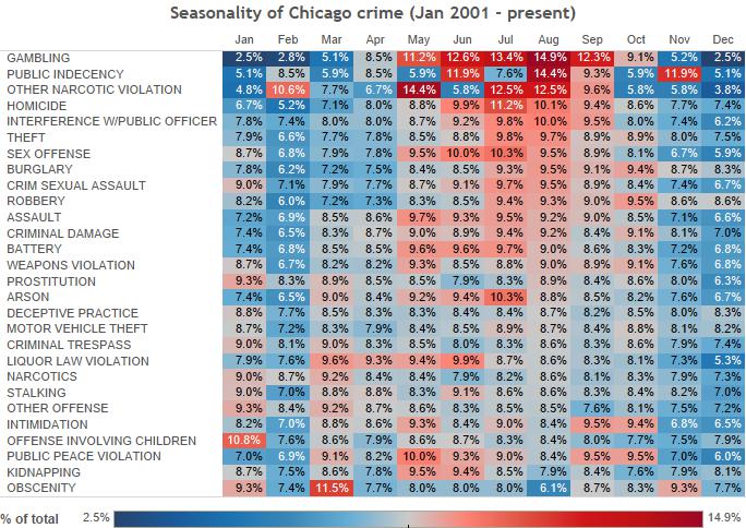
I wrote a couple posts on Chicago crime: 13 data narratives and Chicago crime by hour. But the data are so interesting that I wanted to dig deeper into the seasonality of Chicago crime. Before I was using trendlines to show this, but by switching to a color-box like below, we can more easily compare the difference in seasonality among a lot of different types of crimes.
For example, in the graph below we see that gambling, public indecency, ‘other’ narcotics crimes and homicides are more skewed towards the summer. Stalking & narcotics don’t show much seasonality at all. Obscenity seems like a winter crime.
Some of this makes sense: I wouldn’t want to publicly expose myself in a Chicago winter, for instance. But why would the distribution of narcotics be different than ‘other’ narcotics? In any case, this simple color-coded table is great for packing a lot of easily digestible information into a small space.
Another interesting view is distribution by day of week. We see that intimidation happens mainly on weekdays (perhaps this is mainly a workplace crime?). The same is true of stalking, deceptive practice, obscenity, burglary and a host of other crimes. Other crimes happen more on the weekend, like arson and interfering with a public officer. Homicide and criminal sexual assaults certainly skewed towards weekends. Interestingly, 20% of kidnappings happen on a Friday (compared to about 13%-14% on any other day).
What about arrest rates by day of week? Is there any particular day where, if you commit a crime, you’re more likely to get busted? Don’t commit obscenity on Sunday. But also don’t murder anyone on a Tuesday (55% arrest rate). If you really need to kill someone, do it on a Sunday when you only have a 48% chance of being arrested.
Despite my jesting, this data is very heavy and still quite fascinating. Of course if anyone has more suggestions for better visualizing this data, please comment below.


Leave a Reply