Different states pursue different tax strategies. Most rely on sales or income tax for most of their money, though there are outliers. Natural-resource-heavy states like Wyoming, North Dakota and Alaska rely on “other” taxes. Corporation-heavy Delaware gets a disproportionate amount of revenue from licenses. Below is an initial look at % of revenue from each source for all states, sorted by sales tax. The data come from the US Census Bureau’s 2013 Annual Survey of State Government Tax Collections.
This visualization gives us a lot to look at. The descending order provides a nice ranking for the largest amount of state taxes (sales & gross receipts), but we can also easily spot the outliers. Where there’s a spike, there’s something strange. We also see, for every state, what the breakdown is. While it produces a “busy” visualization, it is also complete in a way that our next visualizations won’t be.
Because we’re looking at states, below are visualizations based on maps. These are less “complete” in that I’ve ditched Hawaii & Alaska to be able to zoom in. Also, the color scaling is nice for picking out outliers, but you can’t easily see the % of tax from each type by state, especially if that state is too small for a label.
But we do get a nice story. If you look at income taxes; Texas, Nevada, Washington, Wyoming and the Dakotas stand out with lower income as a % of total. Oregon, California and a clutch of east coast states get more revenue from income. On the sales tax side, only Oregon and Montana stick out for relatively low sales tax takes. In a sense, the income tax map is a reverse of the sales tax map, but it’s harder to see, than in the first visualization.
If you have a political agenda, maybe you come into this analysis knowing that sales taxes are more regressive, and income taxes are more progressive. Thus a high sales tax will get more revenue from the poor than a high income tax (of course this would also depend on the structure of said taxes).
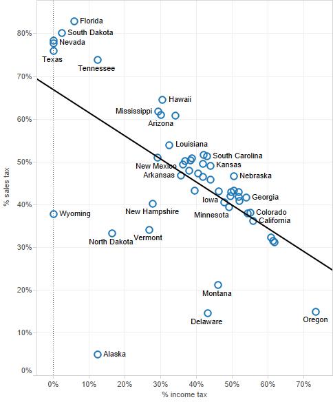
If we narrow down our analysis to two variables only, the best visualization is the scatter plot, which I show below. The negative correlation becomes much more apparent here than in our first two visualizations. With an r-squared of 0.36, this correlation is even model-able. One of the variables will predict the other with 36% accuracy.
The states in the top left take more money from consumers and the poor. The states in the bottom right take more from high earners. This makes sense for most (Texas, South Dakota, Florida & Tennessee are fairly conservative states: Oregon, Massachusetts & California are fairly liberal). But there are exceptions. Washington state, for example, gets 0% of its revenue from sales taxes, 78% from sales taxes. As a liberal state, this is surprising. The outliers stick out here too, and we have a new one. New Hampshire gets an outsize portion of its revenue from property taxes.
In summary, there are a lot of “right” ways to do data visualization. But these “right” ways coalesce around understanding the story of the data. The most important balance you want to achieve is getting a lot of data visible in one place. That way your consumers can find correlations and outliers themselves. But on the opposing side, you also want your visualization to be intelligible. That means putting a lot of data with multiple variables in a small space, and presenting it as simply as possible.
Those opposing forces can drive you crazy (I know from experience). But when you find a good balance, your visualizations will come to life as a story.


Leave a Reply