With most data visualizations, interactivity is wasted on your visitors – they take a look at the graph, get the gist, then move on. But there are times when you want interactivity. Mainly, this is when you want it to act as a reference. Below are some visualizations using census data. I transformed the raw data using Tableau calculated fields to give us a penetration metric by industry (naics description).
The first visual shows a by-state % penetration (number of businesses within an industry / number of total businesses). The interaction is a simple filter by industry. I use color to highlight the higher vs. lower penetration rates.

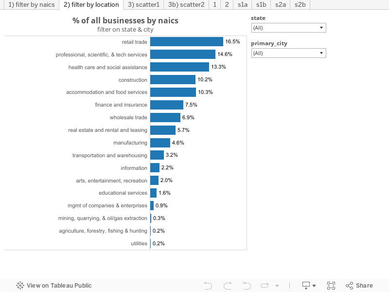
This next visualization is a reverse of the first. Here we have % penetration by industry for the whole country, then filterable by state & city. The filters interact with each other, so selecting California first allows you to see only California cities in the second filter. In Cupertino, for example, the highest-penetrating naics is professional, scientific & tech services at 32% of all businesses.
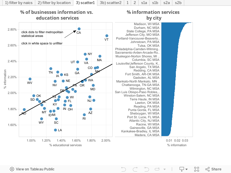
Below is another way to interact with a visualization. Instead of serving as a reference, this is more to drill down into a metric by first spotting an outlier. On the scatter plot, you see a trendline plotting % of businesses in information vs. % in educational services. There is a positive correlation between the two, but California is an outlier (more information businesses relative to educational). By clicking on the dot, you can easily see the % information services by metropolitan statistical area to see where the penetration skews the most.
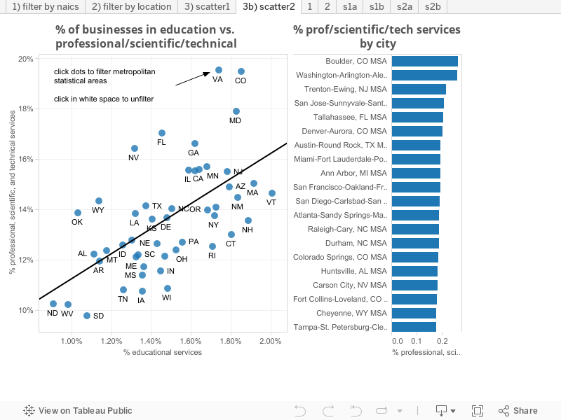
Below is another interactive scatter plot, this time showing the relationship between professional/scientific/technical business penetration vs. education. Clicking on the outlier, Colorado, you then see % professional/scientific/technical business % by metropolitan statistical area.
In summary, there are times when you want interactivity in your data visualizations. Mainly it’s when you want a public visual to act as a reference. But also, you may want to quickly flip back and forth between different variables to discover patterns. Or drill into information as in the above scatterplots.
Leave a Reply