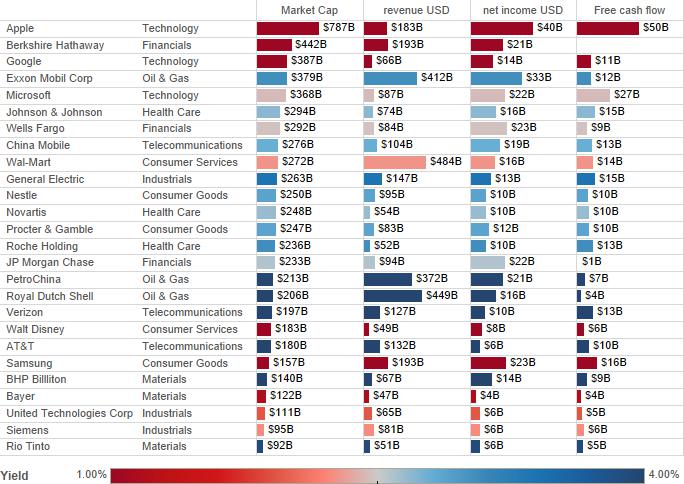
I’ve read a few pieces on how investing in certain sectors can help you achieve out-sized returns. As a value investor, I was curious as to which sectors looked cheapest. Unfortunately there’s not a great place to go for the sort of data I wanted. So I picked the three largest stocks by market capitalization per sector in this Bloomberg/PwC report. Before we roll up by sector, let’s have a look at the sample data by a few different variables.

This multivariate graph is interesting in and of itself. If we were happy with 2014 in isolation, we’d look at where free cash flow or net income bubble out for lower-market-cap companies. Let’s start with free cash flow: Apple (AAPL) generates a huge amount of free cash flow, but has a huge market cap as well. Microsoft (MSFT), General Electric (GE), Roche (RHHBY), Verizon (VZ) & Samsung (SSNLF) punch above their weight in terms of free cash flow. If you look at net income, you add energy companies (because of their massive capital expenditures, this doesn’t make them better investments) and big banks (WFC and JPM do especially well vs. market cap). You also lose Verizon (VZ) because of depreciation, but it still generates a lot of cash. How do our companies line up in terms of Price/Earnings and Price/Book?

In this scatter plot, I had to exclude Amazon (very negative P/E), Apple, Roche & Verizon (very high P/B). While they may present good value opportunities in terms of income or cash, they don’t in terms of shareholder equity (and as massive outliers they overshadow the rest of our plot). This graph is a map to companies that are cheap in terms of both income AND shareholder equity. Samsung looks ultra cheap. So do a lot of oil, materials & financial companies. Let’s roll these up by sector.
Here we see that oil & gas is very cheap, but this is per 2014 earnings. With oil prices at multi-year lows, that P/E ratio will spike when we get 2015 earnings. The same is true for materials companies. Consumer goods companies are also low (because of Samsung). That leaves us with financials as our best-valued sector. But to really understand value, we need to get unstuck in time and look at some history. Below is an aggregated look at some important variables over time.
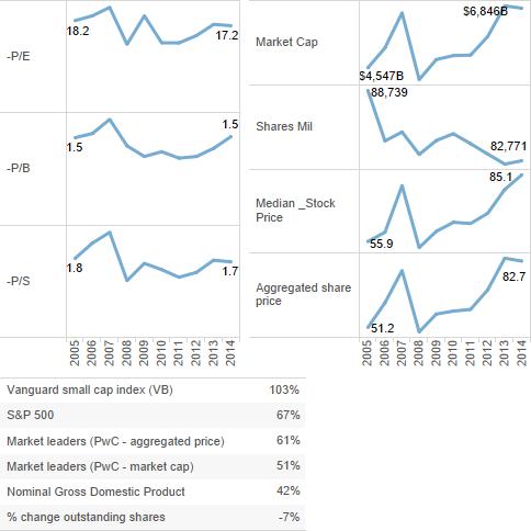
What’s interesting about these graphs is that I don’t see much overvaluation in these companies as a group. This is confusing since every other article I read is about stretched P/E ratios. I added a table below the trends to tease out what’s going on. Since 2005, the S&P is up 67%. But small caps are up 103%. Being market leaders, our companies are larger than the average S&P 500 company, so any current market overvaluation must be focused on smaller-sized companies.
The aggregated price of our 27 companies is up 61%. But their market cap is only up 51%. Share buybacks mean that prices should be up more because we’re seeing a concentration of earnings among fewer shares. That said, market capitalization shouldn’t increase more than nominal GDP (unless margins are also increasing). So since 2005, our 27 companies have outrun NGDP by about 21%. Overall, they aren’t cheap. But talking about a major crash seems far overblown.
Let’s look at valuation metrics over time by sector. Technology, materials and financials companies actually look cheaper than they were in 2005, but for different reasons. Materials companies are depressed in price because the commodities they sell are cheaper. Whether the price of iron or oil or gold goes up or down tomorrow is anyone’s guess. The top three financials look depressed despite a strong recovery from the financial crisis. Technology stocks look cheap(er), though not cheap, mainly because Google, Apple & Microsoft have grown so strongly since 2005.
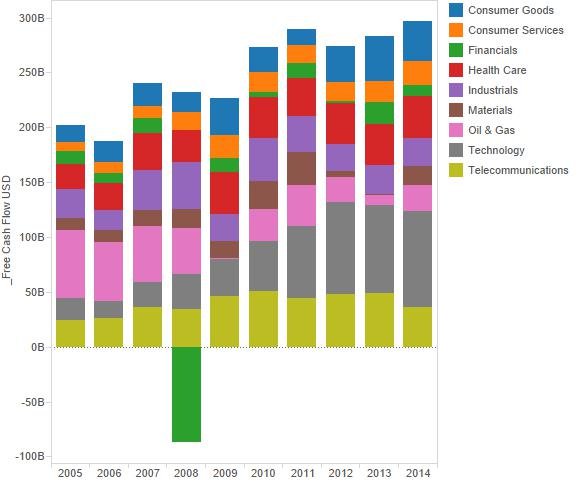
What about cash-flow trends by sector? Here we see why technology leaders are doing well.
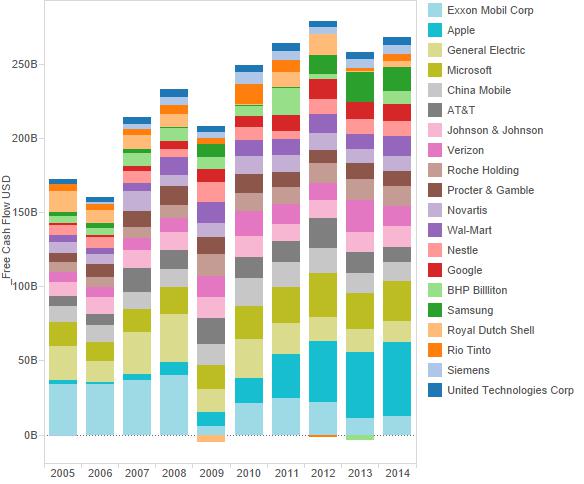
Now let’s look at cash flow trend by company (just including the top 20). Over the whole period, Exxon produced the most free cash, but now Apple now dominates. Microsoft and some of the telecoms also generate huge amounts of cash. Samsung is also doing well, though it has less history as a public company.
Now, I want to zero in on the sectors that look significantly cheaper now than in 2005: financials, materials & technology. This is nine companies from the PwC/Bloomberg study. Here are sales and profits by each company, grouped in their respective sector:
This goes far in answering some of our questions:
- Why are technology stocks’ P/E ratios higher? Just look at the growth below for AAPL, GOOG and MSFT. While I’m not a fan of technology stocks because I want to own companies that will last forever, I must admit that the figures below make these three tempting targets.
- Why are materials stocks getting cheaper? Since 2005, there’s very little pattern to their profits. After all, the profit from commodities is highly dependent on monetary conditions. If those conditions are too loose, we could see a bonanza. But with inflation subdued since the early 1980’s, it’s hard to see these stocks outperforming nominal GDP.
- Why are financials stocks getting cheaper? This is the question with the haziest answer. The data show strongly-climbing net profits, even for the two cheaper banks JPM & WFC. Their low valuations don’t seem justified. The fear hangover from 2008 has unduly remained with these stocks. This explains why Wells Fargo is Berkshire Hathaway’s largest holding.
Below are net income and revenue broken out with their related valuation metrics as the color (and label). Wells Fargo and JP Morgan are a lot cheaper than they were in 2005, yet they have grown significantly in terms of net income. Our materials companies are also cheaper, but for the reasons stated above. Apple and Microsoft have grown into their previously high valuations. The question is, at this size, will they continue to grow as quickly? Well, they aren’t priced to grow as quickly, so there may be an opportunity.
Revenue and P/S show a similar story, albeit with the caveat that our financial companies don’t look quite as cheap. While they’ve done well on profits, revenues seem stagnant. And P/S is somewhat high for technology and financials. In other words, these companies earn fat margins. But will these margins will be challenged by new competitors, fancy products or better technology? In the case of Apple, Google and Microsoft, quite probably. But for our too-big-to-fail banks, the “Fed put” still gives them a lot of opportunity to run. Wells Fargo and JP Morgan look like especially good buys.
This analysis includes Apple (AAPL), Amazon (AMZN), Bayer (BAYRY), BHP Billiton (BHP), Berkshire Hathaway (BRK-A), China Mobile (CHL), Disney (DIS), General Electric (GE), Google (GOOGL), Johnson & Johnson (JNJ), JP Morgan (JPM), Microsoft (MSFT), (NSRGY), Nestle (NVS), Procter & Gamble (PG), PetroChina (PTR), Royal Dutch Shell (RDS-A), Roche (RHHBY), Rio Tinto (RIO), Siemens (SIEGY), Samsung (SSNLF), AT&T (T), United Technologies (UTX), Verizon (VZ), Wells Fargo (WFC), Wal-Mart (WMT) and Exxon Mobil (XOM).


Leave a Reply