On August 9, 2014, Michael Brown was killed in Ferguson. Since that time, murder rates in some cities have spiked. Our current President has extrapolated a society in chaos from that spike. Indeed, we’re tempted to draw the conclusion that the Ferguson killing caused the spike in murder rates. While proving a causal relationship can be tricky, at least we can do a better job presenting the actual data. Below are ten graphs that attempt to show the “Ferguson Effect” in Chicago (homicide and arrest statistics are from data.cityofchicago.org and population data are from the Chicago Tribune).

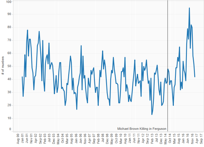
The first graph simply shows murders by month in Chicago. It is hard to read any trend because of the seasonality of Chicago crime. At a macro level, murders have gone up significantly since the Michael Brown shooting. But in the few months subsequent, the number of murders had actually dropped.
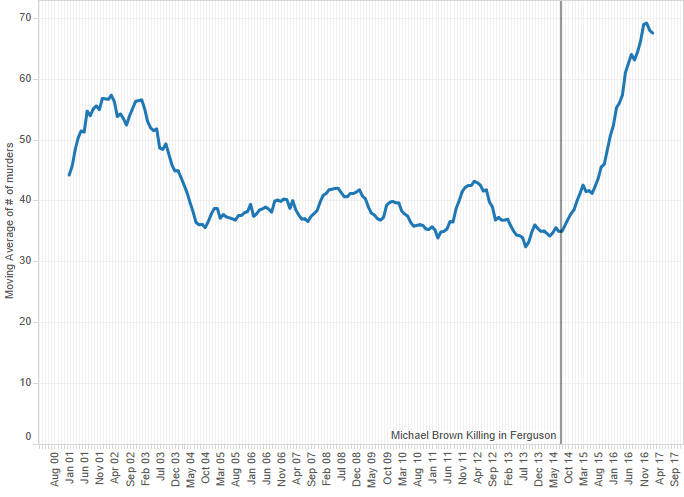
A better way to look at the data is to do a 12-month moving average. This removes the seasonality and gives us pretty clear look at when the trend in murders began to jump. Coincidentally or not, it starts upwards right after the Michael Brown killing in Ferguson. While some people have argued that there is no Ferguson Effect, that the distrust between police and policed has not caused a higher amount of crime, it is hard to argue with the below.

There are two versions of the Ferguson Effect. In one story, increased anger at the police has destroyed respect for law and order. Criminals run rampant. Chaos ensues. This seems to be the story conservative populist politicians like President Trump prefer. A second story is that police anger at increased scrutiny has resulted in less policing of minority neighborhoods. This is a more leftist story about police not doing their jobs. A more right-wing version might say that police are now afraid to police minority neighborhoods. The shootings of officers in Dallas and around the country certainly help this narrative.
One way to look at the Chicago homicide data is by ward. Below is a scatter plot where each of Chicago’s fifty wards is represented by a dot. The y-axis is the murder rate (for the period between January 2001 and February 2017). The x-axis is the arrest rate for the entire period. The color becomes bluer the more white a ward was during the 2010 census.
With an R-squared of 63%, the regression line on the graph is an equation that explains 63% of the relationship between arrest rate and murder rate. That is a very good model. We can say for certain that a lower arrest rate correlates very strongly to a higher murder rate. The clusters suggest a group of very non-white wards with extremely high murder rates plus low arrest rates. The bluer wards at the bottom of the graph combine high arrest rates, low murder rates and are far more white than the city as a whole.

While the relationship is quite strong, and understandably so, it is not necessarily causal. For instance, do lower arrest rates lead to more murders committed because criminals act with impunity? Or do higher murder rates overwhelm and desensitize local police to the point where they cannot arrest as many of the criminals committing these acts?
At this point I find it helpful to divide Chicago. Below is a tale of five cities, majority white wards, majority Hispanic wards, majority black wards and two groups of mixed wards. I’ve sorted them by arrest rate. If you live in a majority white ward, your murders have been solved at a 65% rate over the last 17 years. The mixed white-Hispanic wards are next, then white-black wards. At the bottom are majority-Hispanic and majority-black wards. While high arrest rates (a proxy for effective local government?) follow whites, high murder rates follow African Americans. Majority-African-American wards have the lowest arrest rates for homicide in the city.

Let’s look at the trends of some of these versions of Chicago. Below are the 12-month moving averages for # of murders and arrest rate in majority-white wards. What’s interesting is that the arrest rate moves in tandem with murders from 2005 until 2011. However, in October 2011 it looks like a drop in arrest rate coincides with a bump in the number of murders, both trends which reverse themselves by February 2013 where a sharply rising arrest rate coincides with a drop in murders.
In the summer of 2013 the moving average of murders begins a long ascent while the arrest rate drops. Here it appears as though the cops have fallen behind the trend, especially when the Michael Brown killing happens. Then the number of murders really spikes. But in February 2015, the arrest rate for murders also starts to rise. Does this signal cause murders in white areas to drop from then until now? It appears so.
MAJORITY WHITE WARDS

In black-majority wards, the cyclical nature of arrest rates and murders is just not there to the extent it is in white areas. There could be many reasons. Perhaps political pressure in white areas results in more pressure for the police to solve crimes, which then pushes the number of murders down.
However, in the graph below for black-majority wards, we see a story of dropping arrest rates from late 2004 all the way until mid 2010. The number of murders bumps up only in 2011. Arrest rates follow the bump as of June 2011. This appears to push the number of murders down. The same pattern can be spotted in some of the white ward cycles above.
Further along though when we get to the Michael Brown killing, arrest rates are already dropping, but then drop even further as the number of murders soars. We see somewhat of a bump in arrest rates in late summer of 2015, but this peters out quickly.
MAJORITY BLACK WARDS

The tale of two cities seems to show the Ferguson Effect in full force. Police in white-majority wards respond to rising numbers of homicides with higher arrest rates. The same happened in black-majority wards in the past, but not since the Michael Brown killing (or at least not to the same extent). Black-majority wards are slipping into homicidal chaos without the necessary police reaction to tamp down the violence.
As a final illustration, we should look at two other groups of wards: Hispanic-majority wards and mixed-majority wards (where whites constitute major minorities). In Hispanic wards you see no rise in murders right after the Michael Brown killing. But you do see a collapse in arrest rates. That collapse somewhat precedes Michael Brown’s killing, but really gets going in that month (August 2014).
Hispanic wards seemed to hold up better in the direct aftermath of Ferguson, but the moving average of the number of murders did start to creep up in the summer of 2015. In early 2016, police seem to be responding with more arrests (though not nearly to the same extent as in white-majority wards).
MAJORITY HISPANIC WARDS

Mixed wards with a large chunk of whites did not experience the fall in arrest rates that Hispanic- and black-majority wards did. But they saw a rise in murders.
MIXED WARDS (NO MAJORITY)

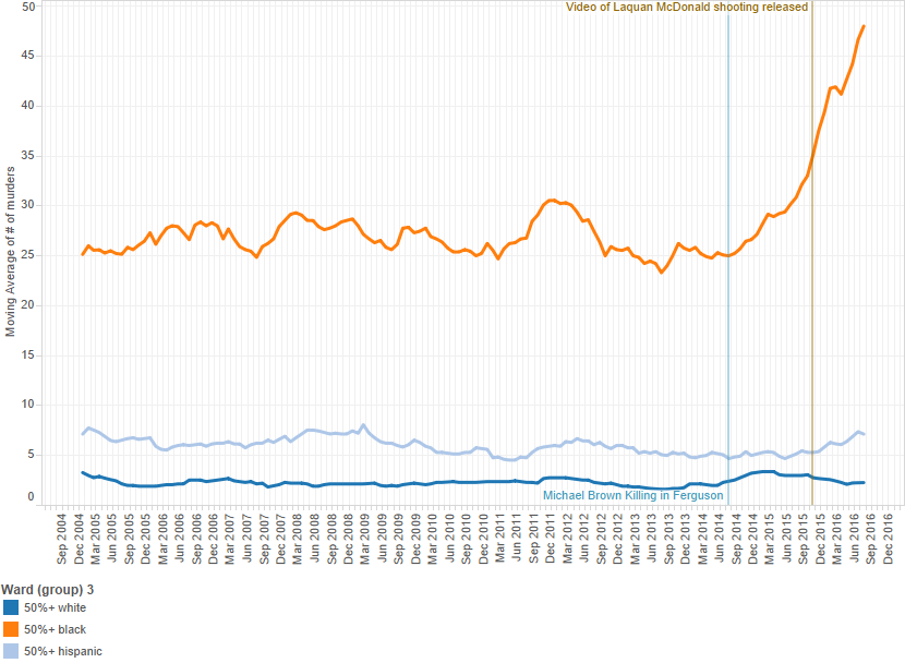
As the above graphs show, there does appear to be two parts to the Ferguson effect. Rising black anger resulted in a higher number of murders (12-month moving average) in almost every month since Michael Brown was killed. Hispanic- and White-majority wards did not see the same rise.
NUMBER OF MURDERS (12-month moving average)

However, rising black anger is only half of the story. Police arrest rates, while responsive in majority-white wards, have dropped precipitously in the face of rising numbers of murders in minority wards. While a little progress has been made in Hispanic wards since the Spring of 2016, there appears to be no help forthcoming for Chicago’s black-majority wards.
ARREST RATES (12-month moving average)

This is only the homicide and arrest statistics for a single major American city. But that city has received a lot of press recently, and rightly so. While Donald Trump’s prescriptions may not be the answer, he should bring attention to Chicago. The number of murders increased by 17% in 2015, then jumped 57% in 2016. The number of murders per day appears to be lower in 2017, but winter months are far less violent than summer.

What should Chicago do? Unfortunately this analysis only seeks to visualize the problems and see if there is a connection to Ferguson. That there is, and that both black anger and police inaction are contributing to the problem suggest that both sides must first come together and attempt to build a level of trust again. If not, then both sides will surely suffer.
“A more right-wing version might say that police are now afraid to police minority neighborhoods.”
Activists have strongly complained about higher arrest rates for blacks and implied that these are the result of racial biases in policing rather than real differences in crime rates. Police departments seem to have an explicit, politically imposed objective to reduce racial disparities in arrest rates. They can’t do that by arresting more whites (since they would be hit with lawsuits left and right), so they have to do it by not arresting as many blacks than they otherwise would.