I recently downloaded a Chicago crime data set at 1.2 gigabytes and around 5.75 million rows of data (1 for every crime committed since January 2001). First of all, kudos to the City of Chicago for making this data public. More kudos to Tableau for designing a product that makes it possible to quickly visualize 5.75 million rows of data without any intermediary staging tables. Just download, extract and visualize. Now, into the data.
1) Number of crimes committed by primary type since 2001
Below we just see total numbers of crimes committed to start getting our heads around the numbers. I excluded some of the extremely low numbers (like ritualism: see visualization #6). Suffice to say, some of the larger numbers are shocking. Almost 1.2 million thefts in 14 years is huge. But the smaller numbers are also surprising simply because of the seriousness of the crime. Over 7,000 murders, 9,000 arsons, 20,000 criminal sexual assaults, almost 6,000 kidnappings, etc.
2) Maps of selected crimes committed since January 2014
With the latitude and longitude of each crime we can generate some interesting heat maps. But including all 14 years of data and all crimes is a little much. So I filtered on crimes over the last 15 months, and only “primary type” that looked interesting.
Kidnapping and arson looks (surprisingly) well distributed throughout the city, except in the downtown area. Homicide and interference with a public officer are more concentrated in the city’s south and west. Of the selections, prostitution is the most concentrated crime. This isn’t surprising as it seems to be the only crime selected that involves a buyer and a seller. Knowing where to go creates a market, albeit an illegal one. What is surprising is the persistence of such an illegal market in a specific area.
With rapid fire analysis, it’s quite easy to isolate a certain area and look at a trend. I’ve done just that below with a two-square-block area that looked particularly active for prostitution in 2014-15. Because the activity was quite low beforehand and then took off, I imagine that either 1) the markets for prostitution move or 2) the markets for prostitution are ubiquitous, but police concentrate on different areas at different times.
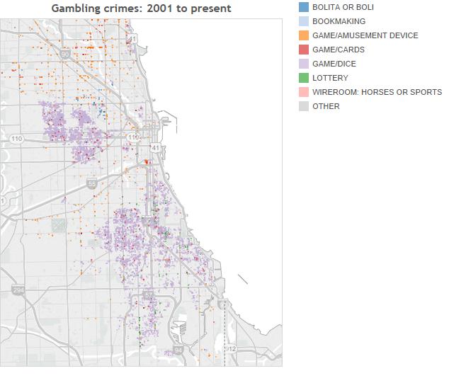
3) Map of gambling crimes by description
I was surprised by the sheer number of gambling crimes in Chicago so decided to map out that particular crime by description. Like homicides, these crimes appear concentrated in the city’s west and south sides. The most prevalent type of gambling crime is game/dice. With an overall arrest rate of 99.2%, there are four narratives that could take shape here. Either the cops are discriminating against a type of gambling that takes place in a poor neighborhoods, leading to a regressive tax on Chicago’s citizens (assuming some sort of fine is involved). Or the poor are less capable of hiding their gambling, making easier targets for Chicago’s police. Or the police are engaged in heavier policing in higher-crime areas of Chicago as part of a “broken-windows” policing strategy. Or there’s simply a LOT more gambling in poorer areas of the city.
4) Map of homicides (overall and zoomed in)
I created a few visualizations in my last post on the diversity of murder rates in American cities. Following that, you can see that inside Chicago murders happen in concentrated areas. Either this is a story of urban blight on poorer areas, or it is a failure of Chicago to provide proper governance for certain areas of the city. The zoomed-in map on the west side shows over 1,800 of Chicago’s 7,000+ murders over the period. For such a small area to contain over a quarter of the city’s murders is mind boggling.
5) Crime near Navy Pier and downtown
I was born in Chicago, but grew up in the suburbs. But I remember fondly going downtown with my family and seeing Michigan Avenue and Navy Pier. Of course as a child or even a teenager, I was far to naive to know that crime is everywhere. The map of crimes near Navy Pier over 15 months until now shows this. Not surprisingly, there’s a lot of theft and a lot of “deceptive practice” marked on this map.
6) Ritualism
Sometimes the most interesting stories are the ones where there are very few data points. In the 14 year time period, only 23 crimes are recorded under “ritualism”. Such a dark name for a crime naturally piqued my curiosity, so below is a map of ritual crimes with a description. For whatever reason, this type of crime seemed to stop in December 2007. Perhaps that’s a reclassification, or Chicago has been lucky since then.
7) Seasonality
I’ve heard that certain crimes are committed during different parts of the year. I don’t trust anecdotes much, so I wanted to see for myself. It turns out that homicides do appear to spike in the summer. Assault shows a similar, but broader, trend. Instead of spiking in the summer, it’s more accurate to say that assaults drop in the winter. Narcotics, stealing cars and prostitution seem to know no breaks. Being crimes of money rather than passion, this is expected.
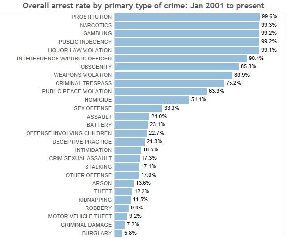
8) Overall arrest rates
The Chicago data include a dimension on arrest = true/false. Below is an overall picture of arrest rates by primary type of crime for the whole 14-year period. It’s tempting to look at this as a prioritization issue. Why would Chicago arrest 99% of the time for public indecency but only 51% of the time for homicide? But there’s a lot of selection bias in these numbers. If an officer reports public indecency, he or she has probably seen it and can make the arrest. I’m sure there’s a lot of public indecency that happens unreported and unknown to our data set.
As the most serious crime there is, a homicide will (almost?) always be reported. There’s probably also a longer time period to solve a murder than a public indecency case. Still, that 49% of murders resulted in no arrests is a little disconcerting.
9) Arrest rate trends (high-arrest-rate crimes)
To answer more questions on arrest rates, we need to look at trends. There are a few ways to do this. It’s best to use line graphs (they work far better for trends than bars) and put them on the same y-axis. This complicates the visualization because it makes it very busy. A stacked bar graph would be far less busy, but you’d get a poor representation of most of your trends. Sparklines are a great way to represent trends when there are “too many”. But by dividing the crimes between high-arrest-rate crimes and low-arrest-rate crimes, we can get cleaner visualizations, and we can easily compare arrest rates across crimes.
Homicides always sticks out: here because the rate is around 60%-63% in the past (so murders committed years ago still doesn’t get the best closure). But it also is interesting because of the downward trend. Again, part of this trend is most likely that the time to close a murder case is longer than for, say, a liquor law violation.
Other trends that stick out: there’s a weird aberration in 2008 where arrest rates for a lot of these crimes drop. And arrest rates for public peace violation / interference with a public officer have climbed significantly over the period.
10) Arrest rate trends (low-arrest-rate crimes)
What sticks out here? The arrest rate for sex offences seems on a downward trend. Maybe more crimes are being reporting without evidence, or perhaps police are taking such crimes less seriously. Like homicides, there could be a long lag time between reporting and arrest. Conversely, arrest rates for stalking and assault have climbed. The aberration in 2008 shows up for these crimes as well.
11) Homicides by location description
Why is it called “street crime”? By the location description, most murders appear to take place in the “street”. A surprising amount also took place in cars. Some of the lower-number-locations are also interesting, such as that 15 murders that happened in a vestibule.
12) All crimes by location description (grouped)
Though a lot of stories are hidden in filtered views, I want to get complete views wherever possible. So expanding on the last visualization, below is a look at all crimes broken down by location description. To make it easier on the eyes, I’ve sorted by % that take place on the street. Prostitution is most prevalent in the street, burglary the least.
12) All crimes by location description (grouped) – line graph
The stacked bar cleans up the visual, but it’s still hard to spot outliers. I’ve created the same graph as 12, but using lines to represent the % of occurrence in each location. Here’s it’s easier to pick out some interesting tidbits, like that arson takes place in vehicles almost 37% of the time. Or criminal trespass takes place 20% of the time in the Chicago Housing Authority. Intimidation spikes up to just over 8% happening in a government building or police facility.
I hope you’ve enjoyed the dizzying array of data visualizations that are possible with a large, comprehensive data set. Each row of data is a story unto itself. With 5.75 million crimes, this is an insane amount of information to pack into a small place. Without delving into any one story too deeply, I hope I’ve given you a nice, broad overview of crime in Chicago.


Nice work. Take a look at my automated visualizations driven by Chicago’s crime database.