I recently came across a fascinating data set – the Inpatient Prospective Payment System (IPPS) Provider Summary for the top 100 diagnoses. The name is quite a mouthful, as is the data on charges at 3,332 hospitals for the top 100 diagnoses. Unfortunately with so many attributes, it’s hard to spot a good story. First I’ll look at some experimental graphs I used to get my bearings, then we’ll get to the visualization that gives us the most information in the smallest amount of space.
I started with something like the below, which shows all the information in a small space, but is fairly unintelligible. Each row is a hospital, the line plots average total payments, and the color is the treatment. It would be easier to just look at overall average payments per hospital and judge expensiveness that way, but if a hospital specializes in treatments that are pricier overall, the graph would be unfair.
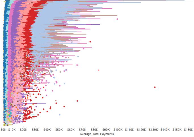
What we do see from this visual is that some treatments have a wide distribution of payments associated with them. That red dot around $131,000 and 2/3 down the table is Pinnacle Hospital in Crown Point, IN. They seem to offer an exceptionally expensive version of “spinal fusion except cervical w/o MCC”.
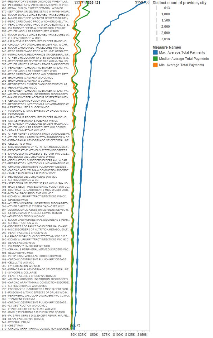
Because it looks like there’s a wide disparity in charges for similar diagnoses, let’s look at each treatment with maximum, median and minimum average payment. From this it does look like the maximum cost is higher for more expensive treatments. But the premiums charged in some cases stretch the bounds of reality.
Let’s look at this graph another way. What is the maximum average payment / median payment? Below we see that the highest premium by percent is for “bronchitis & asthma w/o CC/MCC”. The highest-cost hospital charges 10.2x the median for this particular diagnosis (thank you Sturdy Memorial Hospital in Attleboro, MA).

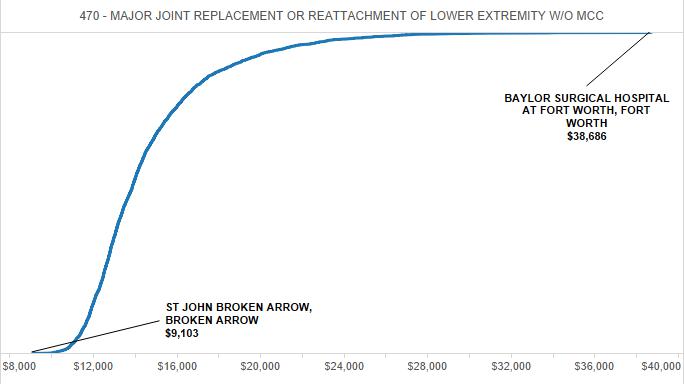
Maybe that’s unfair as well. Sturdy Memorial only had 11 discharges for that diagnosis, and they could have been unlucky. But even if we create a hospital cost curve for the diagnosis with the most discharges (major joint replacement) below, we get a huge disparity between the highest and lowest average payments. This is even when you exclude hospitals with less than 100 discharges.
If we want to get more sense of the distribution of hospitals among the top 10 diagnoses by number of discharges, we could look at a plot like the below. You can see the minimum, maximum and where there’s a lot of hospitals clustered in the middle.

But for a complete distribution analysis, a box plot provides far more information: median (where the dark/light gray meet), upper/lower quartiles, whiskers (at 1.5x IQR), and every hospital that extends beyond the whiskers (as a blue line).

What can we tell from this? It seems our initial thinking was correct. The big story of US hospital data is the disparity in payments for procedures among different hospitals. In some cases these disparities may be a result of the quality of the operation. But the sheer extension of some outliers begs the question: is our supposedly private health system really responding to market price incentives?
Leave a Reply