In my previous post on house price-to-rent ratios in major US markets, I looked at price-to-rent in different zip codes compared to each other. In it you can see where certain areas look over- or undervalued in terms of price-to-rent ratio. That analysis shows a lot of pertinent data in one place, but you’re stuck in time. Maybe, for example, a price-to-rent ratio that looks high in San Francisco is historically high, giving it more justification in the present. Therefore, I wanted to see how the the ratio has moved in various areas.
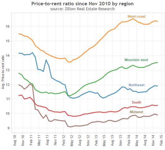
From the regional graph below, since 2010 prices have rebounded strongly in the west while stagnating in the rest of the country (unfortunately Zillow doesn’t give us data before 2010). What’s interesting is the rebound and what it says about the “bubble” to begin with. After all, a bubble is supposed to be a manic psychological reaction to increasing prices. But with prices rising again in the West, is the same bubble happening twice (I don’t believe so) or are higher asset prices simply justified in light of the division between capital and labor?
Also interesting is that we look at Europe as distinct economic areas under a single monetary policy. But we forget that the United States is pretty big. While monetary policy set by the Fed may be tight for the Midwest, South and Northeast, maybe booming property prices in the West portend future inflation here as compared to the rest of the country.
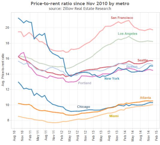
Looking at certain metro areas distinctly, we see that San Francisco and Los Angeles have bounced back strongly. Our other areas are converging in two groups. Seattle, Boston, New York and Portland, OR are between 14 and 16 (with New York the only one with a strong decline since 2010, which it hasn’t recovered from). Chicago, Miami and Atlanta are converging at a far lower ratio of around 10. I have a few hypotheses as to why this might be:
- More water/less-livable options = higher price/rent?
- Tech/entertainment clusters = higher price/rent?
- Higher expected population growth (thus rent growth) = higher price/rent?
Any (or all) these reasons could be true, and would explain the discrepancies below. In my experience, there’s usually a reason markets have over- or undervalued an asset. If you bet against the market, you should have good cause.
Because I live in Oregon (and I originally did this exercise to see how housing valuations compared across locality), below are some cities in Oregon with trends over time. My wife and I are moving from Sherwood (where prices have bounced back more quickly) to Beaverton (which has been a laggard). Though every house is different, this makes me feel like we’re not overpaying for our new place.
Again, valuations rarely happen in isolation. Salem is less desire-able (very far from Portland), so price-to-rent is lower. Bend is far from Portland as well, but it has its own interesting economic and tourism ecosystem, and lots of second homes. As very desired, but far from a big city, it still matches valuation ratios around Portland.
For any sort of valuation, you want to look broadly and deeply to get as full a context as possible. A broad analysis like this one will show lots of options compared to each other right now. But don’t get stuck in time. Valuation ratios have a tendency to revert to their historical average. It may fly higher (lower) for a while because of major economic trends, but eventually the chickens will come home to roost. Except when they don’t…


Leave a Reply