My wife and I are buying (and selling) a house, and the metric I always return to is price-to-rent ratio. Sure, the real estate agent will show you comps for similar homes in the area. And all your friends, family, in-laws will chime in as to what they think a proper price. But price-to-rent ratio has the beauty of simplicity. It’s like a stock’s p/e ratio, and gives us a contingency plan. If you keep your price-to-rent ratio –price / (rent * 12)– below 20, at today’s interest rates you could rent out your house and still pay your mortgage plus tax.
But if you search for price / rent ratio, you either get it by country, or by state. Both divisions are utterly useless for me. I want to know the comparative value of my particular house, maybe compared across neighborhoods or zip codes. If Oregon’s home values are high, it really tells me nothing about markets in Eugene or Bend or Portland. Aggregating can be great for a quick overview, but not helpful to your average home buyer.
Let’s start with a summary and a national city analysis. This will give us a flavor of national prices and some of the outliers.
On average, the price-to-rent ratio in the United States according to Zillow’s indices is around 13.31. With today’s 30-year fixed rates below 4%, that seems like a really good deal. If I could buy a house outright, I could rent it and make 7.5% on my investment. But notice there are some areas where this valuation gets out of whack, mainly in bigger cities. As with stock p/e ratios, there’s usually a good reason for over- or undervaluation. In this case, big cities have lots of people. Some of these people are earning tremendous amounts of money. And if they are willing to pay a premium to own in the posh part of town, the price-to-rent ratio will rise.
If you have tremendous amounts of money, then by all means buy an apartment overlooking Central Park in New York. But if you’re limited somewhat by your income, then it is a better idea to buy only when the price-to-rent ratio is lower than 20.
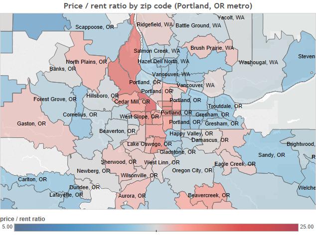
Let’s look at price-to-rent ratios for some major markets. Below are the ratios for the Portland, OR metro area. In the city center, as well as some desirable suburbs, the ratio is getting high. In my situation, my wife and I are moving from Sherwood to Beaverton (ratio goes from 16 to 14). Sherwood is pink, but pretty far from the city center. With its amazing schools, it attracts the kind of people willing to pay somewhat of a premium to own over renting.

I kept the color scaling the same for our other major markets, and you can see that the Seattle area has a lot more red splashed around it than Portland. That means it’s much harder to find a good buying opportunity unless you sacrifice in terms of neighborhood. Most Seattle-ites should stick with renting.

This is even more true of the San Francisco Bay area, where price-to-rent ratios are very high.

Boston is interesting. On a recent trip, my wife and I really enjoyed the North Shore suburbs like Salem, Swampscott and Beverly. But according to people we knew, those areas were less desired than the west suburbs like Arlington and Lexington. This shows on the map. Perhaps it is a transportation issue. The North Shore was somewhat isolated from the rest of the metro area.
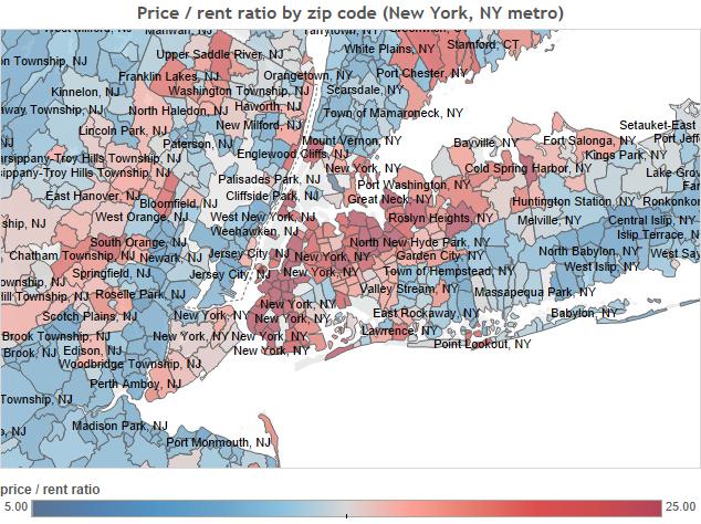
Below are New York’s price-to-rent ratios. I don’t know as much about this market. Suffice to say there seem to be more opportunities to buy near NYC (than San Francisco), but not in NYC.

Compared to other big cities, Chicago looks really cheap. There are just a few north side suburbs where prices are very high. Barrington is a posh suburb where my great uncle lived (he was a dairy company CEO).
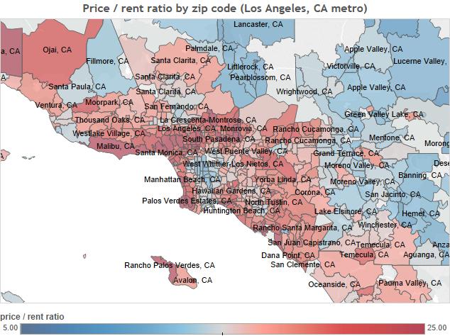
Los Angeles is splashed in red, looking more like San Francisco where there are very few attractive areas for buyers near the city center.
Miami is surprisingly undervalued. Maybe this is due to a lack of a cluster of businesses that would drive up prices. In fact, the cities that look expensive all have this kind of cluster (San Francisco-tech, New York-finance, Los Angeles-Hollywood, Seattle-tech). The other similarity is the prevalence of water on multiple sides of the city. Miami and Chicago are on water, but with large swathes of accessible land nearby.
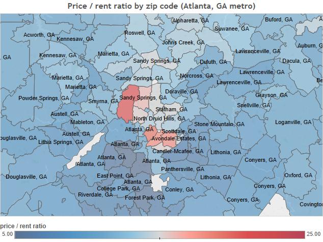
Atlanta price-to-rent ratios look very low too. If you’re in Atlanta and not in one of the fashionable “red” areas, it makes more sense to buy than to rent.

Below is the type of analysis I saw a lot of when searching the web. Again, this is interesting as an overall analysis, but not very helpful to your average home buyer. After all, what does it mean that ratios in California are the second highest in the country? California is a big place. Also, New York state is below the national average. While New York City is expensive, a lot of the cheapest places to buy (vs. rent) in the country are in New York north of Pennsylvania.

But if you’re looking less at your specific situation and more at national trends, this could be a good visual. I’ve added color to show where house prices have recovered their peak vs. where they haven’t. In places where prices shot up a lot during the “bubble” (Florida, Nevada, Arizona), prices haven’t reached their pre-crash peak. But only Florida looks comparatively cheap based on the national average price-to-rent ratio.
In summary, depending on what you’re analyzing, you need to aggregate your data to different levels. I wanted to know if I was buying (and selling) a house in overvalued areas. That might influence my decision on whether to buy or rent. By knowing the price-to-rent ratio isn’t too high, I have a built-in contingency plan if things go south for prices, or for my job prospects. After all, selling a house can be expensive (up to 5% will go to your real estate agent as a commission). It’s not an expense you want to take on lightly.


price/rent ratio is NOT like stock’s price/earnings ratio. Rent is equivalent to revenue. price/rent ratio is like stock’s price/revenue ratio.