A lot of fuss has been made over the map below that shows school shootings since Newtown. This visualization was put out by Everytown for Gun Safety, and republished in the Huffington Post. The problem? The below dots represent all shootings even near schools, even those that didn’t result in a death.

Now, I don’t want to get into a discussion of whether a shooting not involving a death is worthy of consideration, but I do believe that it’s important enough information to include on a visualization. But there’s other information we could include on our map to emphasize the number of deaths. Below is a similar visualization, now including data from 1990 until now, sizing dots based on number of deaths, graying out 0-deaths shootings (so no one can accuse us of hiding information) and highlighting particularly bad shootings.

This is a better map, and presents the data in a way more beneficial to Everytown’s objective. They want to show school shootings as a national problem that affects us all. Getting as much data on the map as possible (going back to 1990), emphasizing number of deaths and highlighting the worst shootings gives this visual much more power along with the additional accuracy. We’ve sacrificed the “since Newtown” story line, but gained more information. But what other ways are there to look at this information? We could look at school shooting trends, like below:

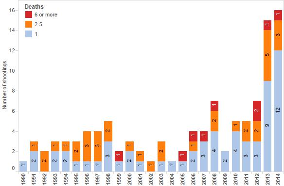
This appears to show that school shootings are a growing problem over time. And doing a distribution by # of deaths like the below shows us that shootings resulting in six or more deaths are occurring with somewhat more frequency (in fact, they’ve occurred in every year since 2012):
All these visualizations make the point of gun-control advocates: school shootings are a big national problem and deserve policy action. But there is another side to this story. What is the context of the numbers above if we look at mortality rates for young people due to injury?
![]()
Motor vehicle traffic leads, but firearms are 2nd. What’s more, by adding “Intent” as a color to our bars, we see that the character of firearm deaths is much different than that of motor vehicles. Mostly these deaths are homicides, but we have a large proportion of suicides as well. In context, firearm deaths among young people still look like a big deal, but the story isn’t quite as catchy as our school shooting map above. What about overall trends?

The trend for motor-vehicle mortality has dropped precipitously over the ears cited while the death rate from firearms appears flat. The Economist has even reported that in 2012, the death-rate for under-25’s due to firearms now exceeds that from motor vehicles (Bangers v. Bullets). This context looks unpromising for gun deaths, not because they are increasingly killing our young people, but rather because cars are killing less young people. So the focus on gun violence will increase.
But gun rights enthusiasts will (rightly or wrongly) point out that we need a cost-benefit analysis of gun laws. If we control firearms more, will that increase the petty crime that we all suffer? Are we more at risk of dictatorship because the government has a stronger monopoly on violence in our society? These may be valid points, but I want to go back to the map for a second:
This map is more qualitative than my other visualizations because the answer to any cost-benefit analysis is necessarily qualitative. When conservatives talk about terrorist attacks, some liberals rightly point out that terrorists kill very few people as a % of all deaths. Why spend trillions on war when cancer or heart disease makes terror look statistically insignificant.
There’s a reason we spend more to stop terror attacks, and it’s because a death from a terror attack simply affects more people than the same death from cancer or heart disease. Don’t get me wrong, every death is tragic. I’ve lost people close to me due to cancer. But the tragedy was very localized to family and friends. When September 11th happened, I didn’t know anyone who died, but it affected me deeply. So did the Newtown shootings. In a sense, the visual of the map captures better our collective psychological trauma from school shootings that tables, line graphs or bar graphs do not. Which means that preventing school shootings may require a cost-benefit analysis akin to what we use for terrorism than for other types of death.
Leave a Reply