I recently read a fascinating post (Fixing the Shiller CAPE) about how changes in financial reporting are affecting everyone’s favorite measure of stock market valuation. P/E ratios are popular for a good reason, but I was wondering how the S&P index has done against something broader like nominal GDP.
Below is a graph that indexes GDP based on the S&P close in December 1950 of 20.43. The S&P index hugs nominal GDP until 1995 when it shoots up. After the dot.com bubble burst, we almost get back to the NGDP index in 2002 when the S&P takes off again. The financial collapse brings the S&P lower than our NGDP index in 2008, but it has zoomed up again since.
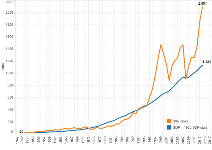
Looking at this historical graph, it looks like stocks are in for some trouble soon. In fact, it looks like they could feasibly fall by 50%. Of course companies are better capitalized and investment is broader with 401k plans, but those are similar excuses we heard in the late 1990’s. Have things magically changed?
In order to understand more, let’s add a ratio – S&P 500 close price per year / $10 trillion in nominal GDP. Here we see a cycle where the ratio starts low, rises the 1,000 level in the mid 1950’s, then drops to 400-600 from the early 1970’s to the mid 1990’s, then rises again until now (ignore the aberration in the late 1990’s).

The question then is, aside from irrational exuberance, is there some macro-economic reason for stocks to have reached such a high valuation ratio compared to NGDP?
In a past article I talked about how monetary policy will affect investors in 2015. In it I describe a few phases of US monetary policy, using growth in nominal GDP rather than interest rates or inflation. Below are 5-year moving averages of NGDP growth and the ratio we talked about above (re-based to billions of USD).

What we’re seeing are 4 phases of American monetary policy since 1950.
- 1950-1954 where we see very expansionary monetary policy (reflation from the late 1940’s)
- 1955-1963 where monetary policy gets tighter and NGDP grows more slowly
- 1963-1982 where policy becomes ultra-expansionary
- 1982 until now where we see a secular trend towards slower and slower NGDP growth as central banks focus more and more on 2% inflation as a target
What’s interesting is that the moving averages appear inversely correlated (especially if you smooth out the late-1990’s stock market bubble). We’re now in a long trend where we expect slower and slower nominal growth, and our paper currency is becoming more like gold. Stocks are seen as a hedge against inflation. But monetary expansion that leads to inflation is terrible for stocks whereas slow NGDP growth helps stocks as assets seek higher returns outside bonds (or savings).
Conventional wisdom says that monetary policy now is extraordinarily loose, but that’s wrong. We’ve seen aggregate demand poke upwards a little since 2008, but not enough to be considered even mildly expansionary. And with our still-somewhat-tight monetary policy, one that won’t countenance over-2% inflation, we should expect stocks to stay expensive relative to NGDP, as they are now. Don’t expect this bubble to pop until the Federal Reserve more significantly loosens policy. And don’t expect that within the next two years.
Leave a Reply