A comment on my blog from spreadsheetjournalism suggested that looking at Chicago crime data in Excel might yield more insights because you could better see crime by hour. This is certainly possible in Tableau, and the visuals will bring quicker insight in rapid-fire succession when compared to an Excel pivot table. Before delving into the data, I suspect that, in some ways, amazing visualization software is making me dumber. When I took calculus in high school, a friend and I were the only two students without a graphing calculator. Of course we understood calculus better than the rest of the class because we had to plot out each graph by hand. Is the same thing happening now? That’s a subject for another post. Now back to Chicago crime data.
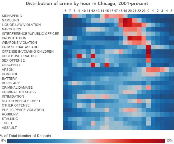
Below is the entire data set looking at % of crime by hour. I moved hours 0-5 to the end since they are “early”. At first I wanted a line graph to see patterns, but to compact the different types of crimes into a small area (and still have it intelligible), the below box made more sense. We can see that some types of crimes take place earlier (kidnapping, intimidation) vs. others that are later (gambling, liquor, narcotics, prostitution). Though homicides are more likely to take place at night, the distribution isn’t nearly as skewed.
Below we focus on one type of crime (robberies) to see if there’s been a change in the time-distribution of crime since 2001. Surprisingly, there was. The red zone (with a distribution closer to 7% of the total) moves from 9pm-11pm more towards 5pm-8pm in 2014.
Less surprising is that different times of year affect the distribution of crime. Looking at a graph of robberies, we see that a greater percentage of robberies happen earlier when its colder. They move later into the night as temperatures rise.
One nice thing about Tableau is the ability to see the same graph based on a different filter. The seasonal pattern of batteries is similar to that of robberies, albeit with a bigger spread throughout the year.
This is doable in Excel. But a few of these visualizations required the entire data set since 2001. Pivoting quickly off the entire 5.75 million rows would be a stretch for Excel, to say the least. Also, the ability to quickly filter and see patterns is much different than working in your typical pivot table. What we do lose in our effort to visualize lots of data in a small space is the ability to show actual numbers. Luckily in Tableau desktop it’s easy to hover and see those exact numbers for reference.
I open up this post to any comments on whether any of you out there feel a little dumber / a little more reliant on software for visual/statistical understanding. With the gain in efficiency, have you lost any deeper comprehension?
By the way, here’s the original article on crime in Chicago: 13 data narratives on crime in Chicago


Leave a Reply